Summary of Work
I got hired in September of 2023 to act as a third-party independent contractor to collect, sort, analyze, and produce clear visualized findings of the physical locations of the American Conservation Experience’s (ACE) projects over four years.
The goal was simple, to understand the physical distribution of work ACE has done post-pandemic for their four government partners; The National Park Service (NPS), The Bureau of Land Management (BLM), The United States Fish and Wildlife Service (FWS), and The United States Forest Service (USFS).
This would be done by visually mapping the data in Tableau and being able to perform certain analyses of the data to develop an inclusive understanding of the data and drawing conclusions including, but not limited to,
- The number of projects in each region
- The number of projects for each partner
- The number of projects per year
- The breakdown of project type, and the connection between project type and location
- The percentage of projects occurring at office locations vs in the field
- The distribution of projects in relation to ACE’s headquarters locations
- Possible locations for potential new ACE headquarters
Step 1: Identification and Collection of Data
I began by developing an understanding of the data I needed to collect. What kind of locations did I include? ACE has two primary types of work; Crew (physical teams of people working in various sites across the US) and EPIC (an internship placement program, usually associated with administrative work), was I to count both locations in the dataset?
The primary source for my data came from the annual reports ACE develops to comply with federal requirements. I reviewed the 2020, 2021, 2022, and 2023 annual reports from each of the governmental agencies and pulled the relevant data into an Excel spreadsheet.
While ACE had previously mapped its work for marketing purposes, there had never been an in-depth comprehensive collection of work location data.
The variables I collected included
- Location Name
- Location name abbreviation
- US region the location falls under
- The years ACE had projects there (2020, 2021, 2022, 2023, or a combination of)
- The report the information came from (the same as the governmental agency the work was done for)
This was collected in an Excel spreadsheet color-coordinated by region, and sorted alphabetically within each region.
More than 400 locations were collected.
Step 2: Longitude and Latitude
Once the initial data was collected, the next step was to add the necessary information to make it Tableau-ready. Tableau uses longitude and latitude to perform location analysis, so after the initial collection of data, I added the specific longitude and latitude for each location.
I also worked with ACE to distinguish between project types, and which ones were for the EPIC program, and which were for Crew.
The final spreadsheet looked like this:
425 rows long and 12 rows wide, I collected 5,100 data points.
Step 3: Tableau Development
After the spreadsheet was complete, I uploaded it to Tableau and began to develop a visualization method, one that would relay the relevant data and allow for modifications to be made so that the necessary conclusions could be drawn.
Eventually, we developed a map that looked like this:
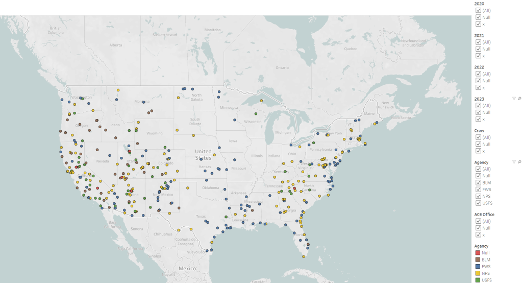
This format allowed us to distinguish between the different agencies ACE partnered with, as well as give us opportunities to filter between variables such as location, year, agency, and Crew vs Epic (the type of project being done).
Step 4: Tableau Analysis
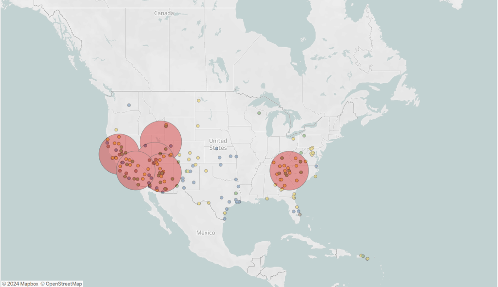
There were a few initial analyses that we knew we wanted to perform, the first being a 250 and 500-mile radius from the current ACE headquarters, specifically with Crew projects.
250 Miles
500 Miles
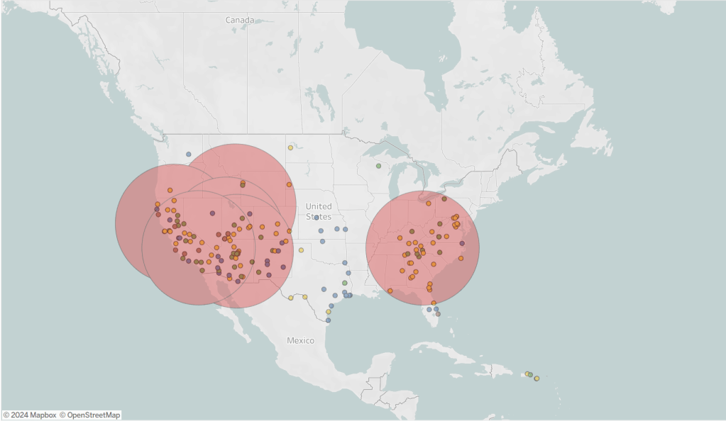
This gave us an understanding of
- How far crews were traveling to complete work (500 miles = about 8 hours driving; 250 miles = about 4 hours driving)
- How many Crew projects were being completed in specific locations
- How many Crew projects were being completed for each agency
- How many Crew projects were being done far from ACE headquarters
Since then, we’ve performed many different types of analysis through Tableau and have successfully met the goals of this project.
If there are any questions about the work that was done, please reach out under the “Contact” page.
